a1329
Release notes Skribenta Web
Introduction
This is an official Skribenta release after half a year of development and more than 250 internal commits!
In June, we started the development of a new user interface. The background was:
-
The Skribenta Web user interface is somewhat unique, and it takes a while to understand it - the threshold for new users had to be decreased.
-
Conventional interfaces have advantages in certain situations
If you compare a conventional UI with Skribenta, these are the main differences:
-
In a conventional UI, you have a frame for navigating and another for viewing the content.
In Skribenta navigation and content are intermixed as you expand your way through folders and into the files.
In a mail client, for example, you can navigate between mail groups and their email lists and finally select one email to read. You can never view two emails at the same time.
In Skribenta you can expand several files, but you have to scroll to see the content of each
-
In a conventional UI, you have a separate frame for tools and properties.
In Skribenta, the tools and properties are handled by embedded toolbars which make them an integral part of the information flow.
In Skribenta, you can, for example, view the attributes for different elements at the same time and copy them from one to another
People are different, and situations are different - there are pros and cons for everything. So as always, the solution is not to throw the old design away but to combine the two ways of working.
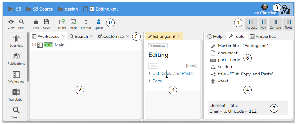
This screenshot highlights the significant changes in the new UI:
-
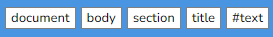
The UI is divided into four frames.
The frames can be switched on or off with the four buttons in the upper right part of the top toolbar. Switching off the Content and the Tools frames will make the UI look like before.
The leftmost frame is the Aspect frame which has a fixed width as before, but it can now be scrolled vertically.
-
The Navigation frame is primarily used to navigate to the files you want to read. Clicking on a file will open the file in the Content frame.
If you want the file to be expanded in the Navigation frame (as before), you can click on the plus icon or use the Expand button (Ctrl+ArrowDown). If the Content frame is off, files are expanded as before.
-
The Content frame is primarily used to view and edit files. Each file will get a separate tab.
You can also view folders by pressing Enter on a folder in the Navigation frame.
You can drag the border between the Navigate and the Content frame to set the relative widths. Resizing the window will maintain the relation.
-
The Tools frame contains three fixed tabs:
Help for presenting online Help
Tools for presenting the path down to the caret and the toolbar on each level
Properties for presenting the properties for the current object
The width of the Tools frame is fixed - it does not change if you resize the window. However, you can drag the left border to set the preferred width.
-
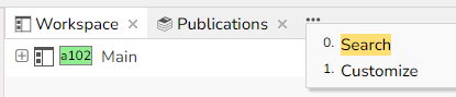
The Navigate and Content frames can have several tabs. If the tabs do not fit, three dots appear, which can be expanded:
Right-clicking on a tab brings up a typical Tab panel:
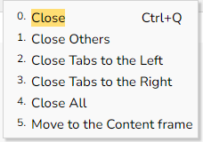
The last option means you can move tabs between the Navigation frame and the Content frame
You can click on a tab icon and drag it to a suitable position
The current tab has an orange background which makes it easy to locate the current frame and tab
With two frames, you can view two files side by side and visually compare them.
-
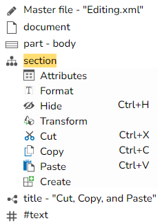
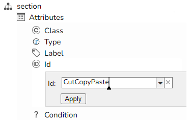
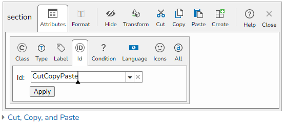
The Tools tab contains the breadcrumb, i.e. the path down to the caret. This replaces the breadcrumb previously presented at the top.
You can expand the items in the path to present the toolbar for that item. Here the section is expanded:
The toolbar buttons can be further expanded and finally executed:
If you close the Tools frame, the breadcrumbs will appear at the top as before
Clicking on a button will open the embedded toolbar as before.
-
When you move the mouse, information regarding the position is presented at the bottom of the Tools tab. It was previously presented in the top right corner in a smaller font.
It is a quick way of investigating characters, elements, files, etc.
-
The Configure aspect button has been moved from the Aspect frame to the top right corner. Clicking on it will present the Configure toolbar as before where you can select a workspace, set your profile photo, log out, etc.
Previously the bar between the Aspect and Navigation frames was thick, and the colour indicated the current role. Now your current role is presented in a button in the upper right corner. This is the Technical writer role icon:

You can click on the button and select another role, if applicable.
-
The top toolbar is simplified.
The Edit button is removed. You are always in the Edit mode except when you are using the Reader role. A Reader is always in the Browse mode.
The View buttons (Previous, Close, Next) are removed. The tabs in the Navigate and Content frames effectively replace them,
Three View options have been removed:
-
Icon text

This option could remove the text under every button, but we don't think anyone used this option.
-
Pinned toolbars
The pinned toolbars were introduced when the Callout web version was developed because the embedded toolbars could not be used in Callout.
Introducing the Tools in the Right frame offers an excellent replacement for the pinned toolbar.
-
Button help
This was an experimental feature. It is replaced by the new Help concept.
-
Improvements
More on working with frames
-
You can scroll the content of a frame with the mouse wheel, and you don't have to select the frame first. The frame will automatically be selected as the current one with its caret.
-
The background colour inside the frames is a very light grey. This makes it possible to know where a file or an image is ended visually
-
When hovering over the vertical frame separators, they are wider to make them easier to grab
-
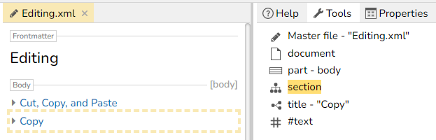
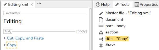
When moving the caret inside the Tools items, the source in the current frame is indicated by a dashed border. This makes it clear which object will be affected by the tool. Here, the Copy section is the current section.
Here, the caret is moved down to the title:
-
The online Help
Clicking the Help aspect button or pressing the F1 button will present a context-sensitive help in the Help tab inside the Tools frame. In this example, the caret was standing inside a paragraph:
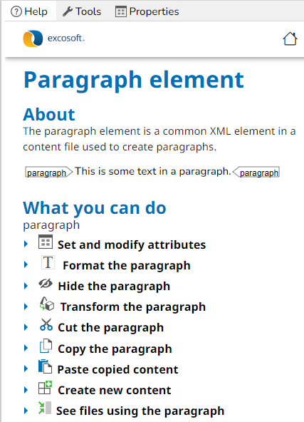
You can dig into all the details by expanding sections and following links.
The Help information is fetched from the Skribenta Help server. The instructions will be updated regularly so you will always get the latest help.
The information presented will correspond to the Skribenta version you are currently running.
Presentation of Flex
There are some improvements to the Flex XML presentation:
-
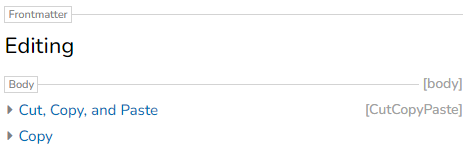
The different part elements (frontmatter, body, endmatter) are styled, making it easier to see where you are. The id presentation on the body part is also improved - previously it was "competing" with an id on the first child section.
-
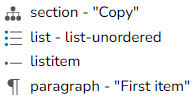
The list item element has got an icon
-
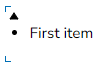
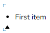
The caret positions at the start and end of a list have been improved:
-
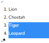
List item bullets and numbers are now visible when the items are selected:
-
The type attribute is now presented in a unit phrase:

Spell check
Spellcheck with LanguageTool is now supported as an alternative to Grammarly. This means:
-
More languages can be checked:
Arabic, Asturian, Belarusian, Breton, Catalan, Chinese, Danish, Dutch, Australian English, Canadian English, GB English, New Zealand English, South African English, US English, Esperanto, French, Galician, Austria-German, Germany-German, Swiss German, Greek, Irish, Italian, Japanese, Khmer, Persian, Polish, Angola Portuguese, Brazil Portuguese, Moçambique Portuguese, Portugal Portuguese, Romanian, Russian, Slovak, Slovenian, Spanish, Swedish, Tagalog, Tamil, Ukrainian;
-
Text is not sent to the USA which some companies don't like
-
There are no Grammarly integration problems (e.g. spell checking the text in panel buttons)
To activate spellchecking you need to do the following:
-
Specify the languages you want to check inside Configure:
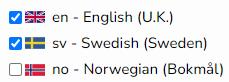
Specifying just one language and "en" indicates you still want to use Grammarly
-
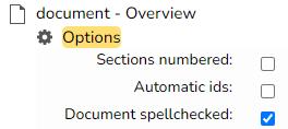
Make sure the Spellcheck option in the document element is On
-
The file must have a flag
When you expand into a file and spellcheck is activated, the whole file will be checked - not just the visible text.
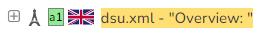
The number of mistakes in the file will be indicated beside the document element in Tools.
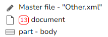
In this case, it is 13 mistakes in the file. The number will be continuously updated when you are editing the file.
Clicking on the number will find the next mistake.
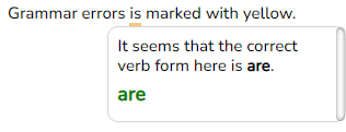
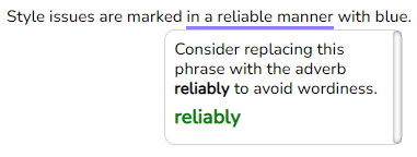
The visible mistakes will be underlined in different colours:
-
Red
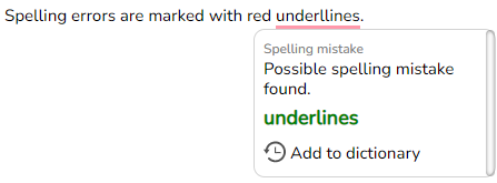
A spelling mistake can be an unknown word for LanguageTool and can be added to a dictionary.
-
Yellow
-
Blue
Search
The Search aspect panels have been slightly revised:
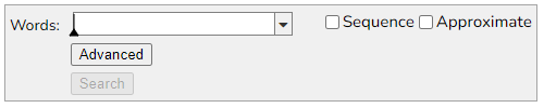
Clicking on the Advanced button will add more search options:
-
You can search for files having a property name, a property value, or a combination
-
You can search for files having a name, an extension, or a combination
-
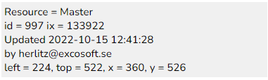
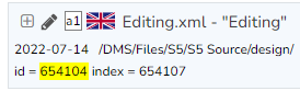
You can search for a file having an id (the logical name) or an index (ix).
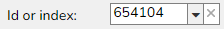
The search result will tell you which one, in this case, the id
-
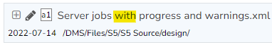
Each word in a file name is indexed. If searching for the word "with" you can get this hit:
You can have more complicated search patterns, like:

This will find the same file as above because the file name contains all the words "progress", "warnings", and "Server"
File Tags
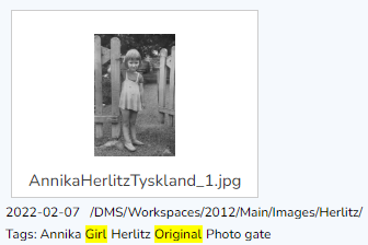
A Tags property has been introduced on files to improve searching and to get better search results.
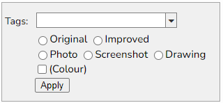
Let's say you have a massive amount of images and you want to tag them with some appropriate categories. This process can now be supported by customized panels.
Here is an example for images:
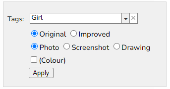
You can then type in some unique tags for the image and select the appropriate categories:
In the Search panel, you select the tags you want to search for
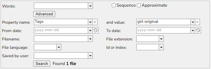
The query resulted in one hit:
The search result presents all tags matching the query, in this case, 2 out of 6 tags.
You can set the Tags property on a file by clicking on the Tags button in a file toolbar:
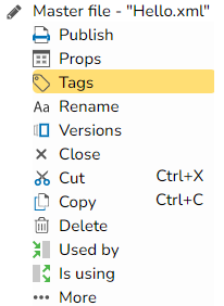
A panel will be presented, containing radio buttons and checkboxes. The panel can be different for different resource types, e.g. images and master files.
This is a panel example for master files:
The panel definition for different resource types is set in a parent folder. This makes it possible to have different panels for different files in different contexts.
Here's a definition example:
DefaultTagsImage = R:(Original Improved); R: (Photo Screenshot Drawing); C: (Colour);
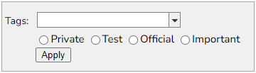
DefaultTagsMaster = R:(Private Test Official Important);
The syntax for the definition is as follows:
-
A semicolon ';' is separating different lines in the panel
-
The prefix "R:" specifies radio buttons. The names inside the parenthesis will be the radio buttons inside one radio button group.
-
The prefix "C:" specifies a checkbox.
Image zoom
Studying the images inside developed manuals is an essential part of the job for a technical writer. You often want to zoom in on details or quickly browse through all the images in your manual. This job is now supported in the UI.
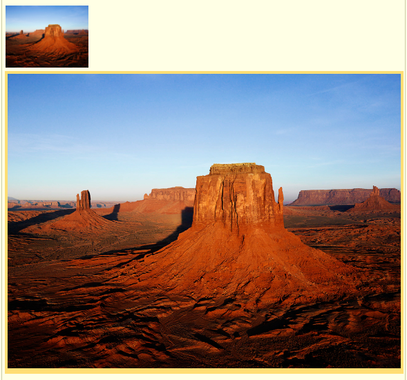
Let's say you have this paragraph and image inside your manual:
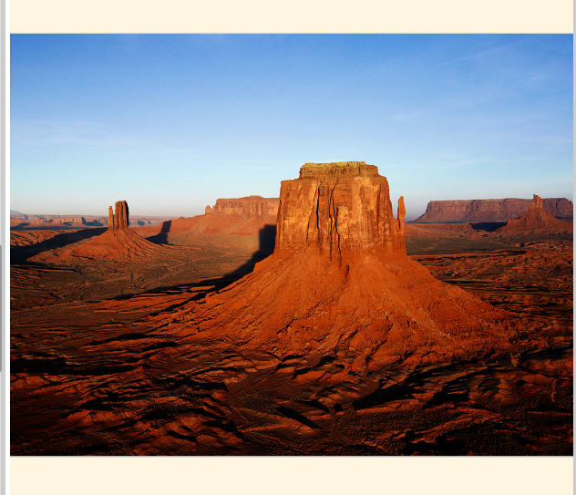
Expanding the image will present it at full width:
Clicking inside the expanded image will update the Tools and add a Zoom button:
The Zoom button will create a view, showing only the image:
You are now in Zoom mode.
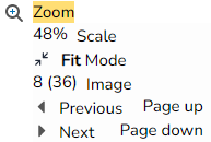
The Zoom button is expanded to a Zoom panel:
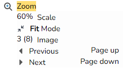
The panel contains five items:
-
The Scale indicates how much the image has been scaled
-
The Scale Mode, in this case, Fit, specifies how the image shall be scaled
-
The position of the current Image (3) and the total amount of images (8) in the file
-
Move to the Previous image in the file
-
Move to the Next image in the file
The Mode button brings up this panel:
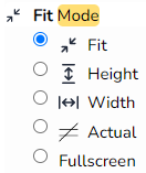
The meaning of the options is:
-
Fit: The image will be scaled, so it fits in the available window space, both horizontally and vertically
-
Height: The image will be scaled, so the image height is equal to the available window height
-
Width: The image will be scaled, so the image width is equal to the available window width
-
Actual: The image will not be scaled
-
Fullscreen: The image will be presented in full-screen mode
You can zoom in and out with the mouse wheel, and you can move the image by clicking and dragging
If you click on the image, you can use Page up and down to step between the images.
Click on the Zoom button again or press Escape to leave the Zoom mode.
The images included inside the Zoom mode differ depending on the Zoom context:
-
If you expand an image inside a file. all images in the file are included
-
If you expand an image inside a folder, all images in the folder are included
-
If you expand an image in a search result, all images in the result are included
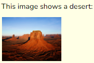
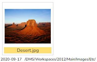
For example, here we have searched for all jpg images where the file name starts with "de":
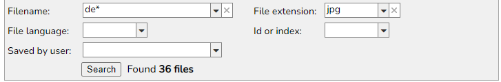
One of the 36 images found is the Desert image:
Clicking on Zoom will present this panel:
Now you can quickly browse through the 36 files in the search result and investigate them one by one
State handling in Translation
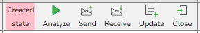
The Status button in the Job Process toolbar in a Translation or Improvement project has got a new design and extended functionality.
The colour and position will indicate the current state of the job in the process
Here is a complete process:
-
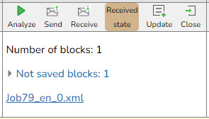
When a Job is created (or analyzed/queried and it contains no blocks) it will look like this:
-
After an Analyze or a Query and the job contains blocks it will look like this:
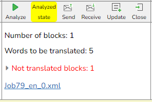
if no blocks are found, the state will not change.
-
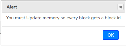
If you click on Send you will get an alert:
-
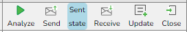
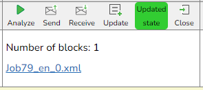
After clicking on Update, you can click on Send again. Then you will get this:
-
After clicking on Receive and pointing to a translated file you get this:
-
After clicking on Update you get this:
-
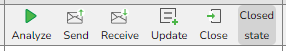
Finally, you can click on Close to indicate the job is done
A project file typically contains many jobs. The state of the project as a whole is considered to be the state for the job, being in the earliest stage in the process. If all jobs are in the Updated state except one, which is in the Sent state, the project state will be Sent.
The project state is indicated in the list of projects:
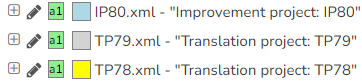
You can quickly identify projects, for example, waiting for translation jobs to be received.
File locking
A very annoying bug has finally been fixed. From time to time you could not edit a file because it was being locked by yourself. You then had to do a Forced unlock to be able to continue editing.
If you reload the page or close the browser and you have any locked or unsaved files, you will be asked for a confirmation:
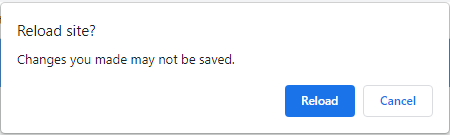
However, the files are automatically saved and unlocked when the panel is opened, so the question is in fact not necessary - you can safely reload the site.
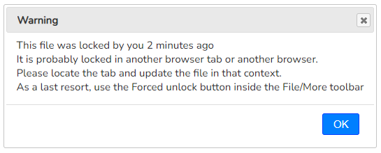
A file might be locked by yourself for real if you are editing it in another browser or in another tab. You will now get a more elaborate warning:
New shortcut keys
Some shortcut keys have been added:
-
Ctrl+M
This shortcut key presents the current file or folder in a new tab. The function is sometimes referred to as Maximize
The caret position inside expansions is maintained afterwards
-
Ctrl+Q
This shortcut key closes the current tab
-
Ctrl+Insert
This shortcut key works the same as Ctrl+C (Copy)
-
Shift+Insert
This shortcut key works the same as Ctrl+V (Paste)
-
Shift+Delete
This shortcut key works the same as Ctrl+X (Cut)
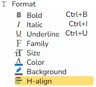
Horizontal alignment
The horizontal alignment can now be set with the H-align button in the Format toolbar (which you will find inside the section, wrapper, list, table, and paragraph toolbars):
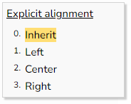
Clicking on H-align will bring up this popup:
Embedded images
If you have a lot of embedded images (e.g. screenshots) in a file, it may increase in size considerably and the loading time will increase. You can solve the problem by saving each embedded image as a separate file.
However, if the file contains many embedded images that will take time. Now you can save all embedded images in one operation by checking a checkbox in the panel:
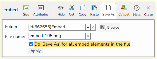
Table head
When you have a table in your master file, it will have a table head in most cases.
When creating a table, it will now contain a table head by default. It is a quick operation to remove it if not wanted.