a1766
Release notes Skribenta Web
Improvements
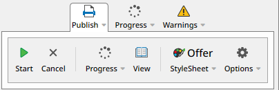
Floating toolbar
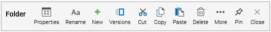
A toolbar, for example the Folder toolbar, looked like this before:
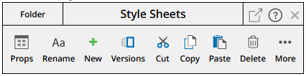
Now it looks like this:
-
The toolbar contains two rows - a header row and a button row
-
The header row contains the resource type (in this case "Folder"), the resource name (in this case "Style Sheets"), and three buttons:
-
Floating - converts the toolbar into a Floating toolbar (see below)
-
Help - presents help about the toolbar in the right frame
-
Close - closes the toolbar
-
-
The button row contains all the toolbar buttons
A Floating toolbar looks like this:
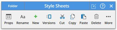
The header row has a blue background in a floating toolbar. The Floating button points inwards to illustrate that it makes the toolbar embedded.
As before, you can have many embedded toolbars open at the same time. Only one toolbar can be floating - clicking on the Floating button on an embedded toolbar will make any other floating toolbar embedded.
When you hover over the resource type or the resource name, the mouse turns into a "move" cursor:

This implies you can click and drag the toolbar to a new position.
A Floating toolbar has a target object - the object on which the button operations will be applied. To indicate this connection, the target object has a dashed blue border:

Toolbars are by default floating when created. You can control the default behavior in the View options:
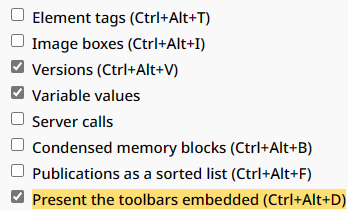
Note the shortcut key: Ctrl+Alt+D
The caret can walk in and out of a toolbar by pressing the arrow keys - this implies to both embedded and floating toolbars.
Toolbar layout
Buttons will now contain a little icon if the button is expandable - i.e. it will present sub-buttons.

Buttons not having the icon will execute a function directly, for example the Hide button:

The same applies for buttons inside Tools and Popups. The icon is then appended to the button name:

In the previous release, an expandable option was indicated with an arrow on the right side:

If you want to expand an option in a Popup you can now click anywhere inside the text - not just on the arrow
If you want to open the toolbar you can press Enter or click on the icon to the left. Previously, the toolbar was opened when you clicked anywhere inside the text.
The All button inside the Attributes panel has been redesigned to be less wide. Now it looks like this:
Toolbars and user roles
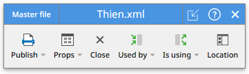
The toolbars have been simplified for Content providers and even more for Readers.
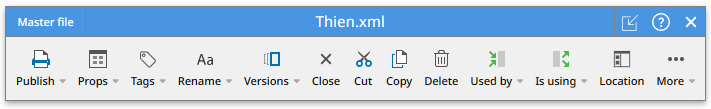
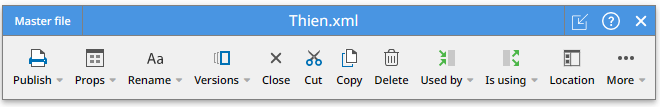
This is the toolbar for a Master file for a Technical writer:
The same toolbar for a Content provider:
The same toolbar for a Reader:
The Administration aspect is now available only in the Admin role.

Creation and modifying
The difference between the Top toolbar and the Tools has been clarified:
-
The Top toolbar is mainly used for creating elements
-
The Tools toolbars and the embedded/floating toolbars are mainly used for modifying existing elements
The "create" buttons as indicated below are removed from these toolbars.
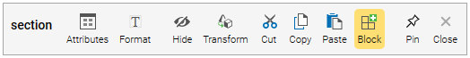

The Block button in the Top toolbar works the same as the Block button in the toolbars.
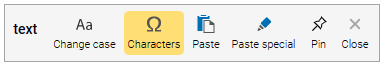
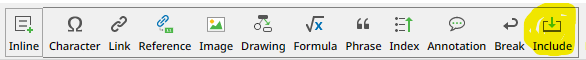
The Character button is part of the Inline toolbar:
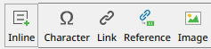
The Inline toolbar has also got a Reference button, previously part of the Text toolbar. The Reference button is explained in another section.
The target element for a toolbar
Now the embedded toolbars also have a dashed border - in light gray
This is to make the connection between the toolbar and the target element more clear.
Here's a paragraph with inline elements:

Here a toolbar is opened for some embedded elements:
The target element can be indicated in three ways:
-
With a blue border when connected to a floating toolbar
-
With a light gray border when connected to an embedded toolbar
-
With an orange border when connected to a toolbar in Tools
Toolbars are always placed before an element
Previously some inline toolbars were placed after the inline element
Image viewing
When you expanded an image element in a content file, the image was presented as an expansion. Now you are entering an "Image viewing" mode.
Let's say you have 2 images in a Flex file:
Double-clicking the first image now presents the following view:
In this mode you can zoom in and out with the mouse wheel and drag the image around with the mouse:
Page Down and Page Up will show other images in the Flex file:
With this feature, you can quickly browse through all images in the file.
The Escape button terminates the viewing mode.
When you hover over the tool icon in the upper left corner, a toolbar is presented:
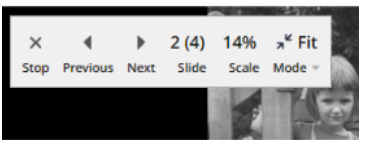
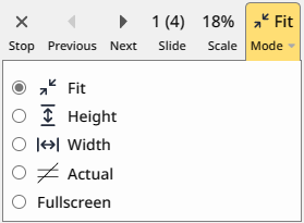
The image can be automatically scaled in different ways depending on the scaling mode:
-
Fit
The image is scaled to make the whole image visible
-
Height
The image is scaled to fill the available screen vertically
-
Width
The image is scaled to fill the available screen horizontally
-
Actual
The image is not scaled
-
Fullscreen
The image is presented in Full-screen mode
You can expand an image in other situations:
-
In a folder - all images in the folder can be viewed
-
In the Search aspect - all images in the search result can be viewed
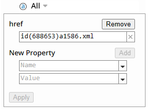
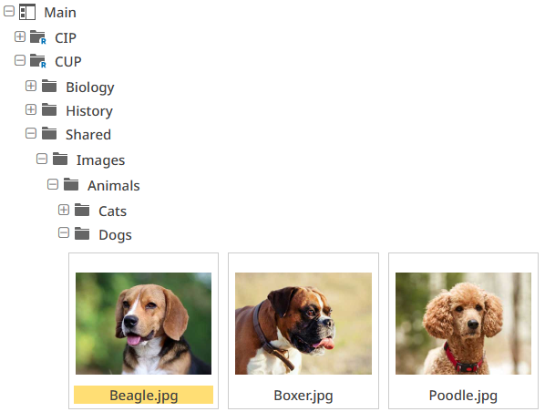
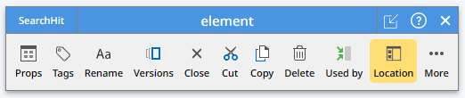
The Location button
Let's say you have an image in your master file:
If you want to know where the image resides in your workspace, you can now use the Location button in the image toolbar:
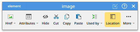
The button will open the Workspace aspect and expand folders down to the image:
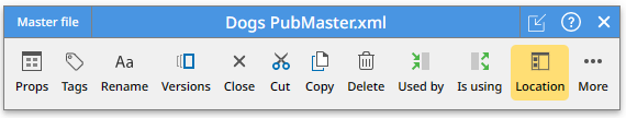
The Location button is available in many toolbars.
-
In the link toolbar:
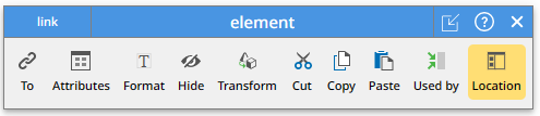
-
In the include toolbar:
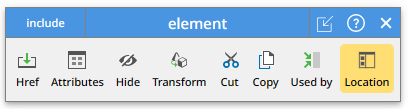
-
In the master file toolbar:
-
In the image file toolbar:
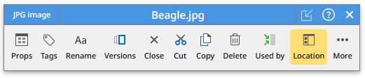
This toolbar appears when you expand an image and select the Image option in the popup:
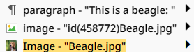
The Location button is very useful in the Search aspect.
Straight or branched checkout
When checking out a file or a folder with the Checkout button in the Versions panel you are asked for a confirmation:
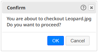
Pressing OK will create a branch in the version tree:
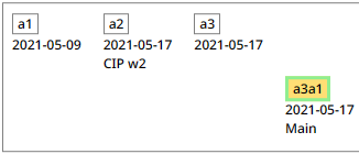
An exception is for a Reference folder - it is always checked out straight because a branch is considered permanent.
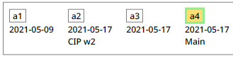
In the Admin role, the Checkout button will bring up this confirmation panel:
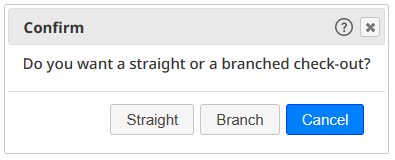
Selecting "Straight" will create a version tree like this:
Set and unset all checkboxes
The Languages sub-panel inside the Publish panel now has a Set/Unset all button.
If any checkbox is not set, the button will Set all of them.
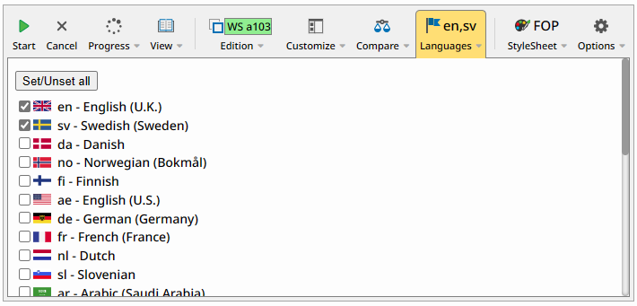
If all checkboxes are set the button will Unset all of them.
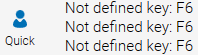
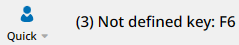
Repeated messages
Messages are presented in the top toolbar:
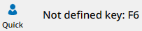
When the same message was repeated, new messages were added:
Now the message is presented with a counter as a prefix:
Frame tabs
The Navigation frame and the Content frame typically have a number of tabs, pointing to different resources.
When the browser is restarted, the tabs in the frames are now restored! This means you can continue from the situation where you closed the browser. However, the caret positions are not (yet) maintained.
When the Skribenta Web is restarted it is usually started from a URL, containing a path to a resource. At start, the client will expand down to the resource and make it the current one.
When the frames are resized, some tabs might be visible or not. The current tab is, of course, always visible.
New tabs are appended on the right side. An exception to this rule is when a file or folder is "maximized" (Ctrl+M), then a new tab is added to the right of the current tab.
Tabs can be dragged to a new position - click on the tab icon, drag it to a new place and drop it. You can even drag a tab to the other frame.
The shortcut for selecting the tabs, one by one, is Alt+ArrowRight and Alt+ArrowLeft.
The reference element
A publication typically contains references to different parts of the published publication. It can be to another section, a particular table or figure, a counter, or a footnote. It might look like this:
-
Please refer to Section 4.3 Starting options on page 65
-
This is illustrated in Figure 24 Connections on page 22
A reference is always based on a link - the link is the connection to the referred part.
There are different link types:
-
Reference
Please refer to something
The reference content is created by the stylesheet and the link content ("something") will be discarded. The stylesheet completely creates the reference, like the example above:
Please refer to Section 4.3 Starting options on page 65
The stylesheet figures out the first word (Section, Chapter, or Appendix), the actual section number (4.3), the title ("Starting options"), and it requests the page number to be included. It also makes the reference italic.
-
No type
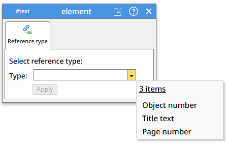
In this case the technical writer writes the reference explicitly. The different parts of a reference are represented by reference elements. There are three different reference classes:
-
Object number
-
Object title
-
Page number
To get the same reference as above you will create this inside the link:
Section on page
The publishing engine will replace the reference elements with the actual values
-
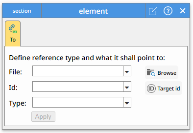
The reference button in the Inline toolbar will open this panel:
This happens if a link already exists. If not, the following panel will be opened, where you can also define the link;
Search in folder
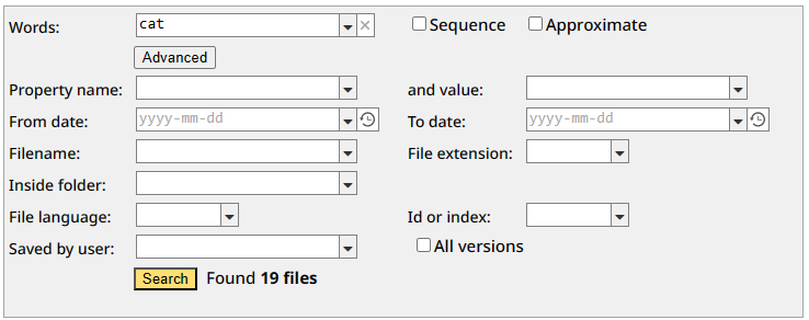
You can now limit a search to only get hits inside a particular folder and its sub-folders.
Here we are searching for all files containing the word "cat" and found 19 files:
Here we are limiting the search and found only 2 files:
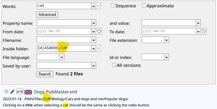
Note the "CUP" folder inside the file path.
Spellcheck
Spellcheck now supports a public dictionary. The dictionary is pointed to by a variable, typically placed in the domain recipe:
Skribenta.Spellcheck.Dictionary
The private and the public dictionary formats are the same. A dictionary may contain a structure with sections, and it also honors the hidden feature.
The spelling mistake panel now contains a button for viewing the personal dictionary:
You can update the dictionary file as any other file.
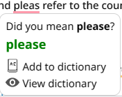
When you add a word to the dictionary, you will get this question:
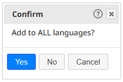
If you select Yes the word will be considered correct in any language. A good example is the word "Skribenta" which is never a spelling mistake.
Spellcheck includes phrase content by default except for affix, inline-if, and translation-hint.
There is a "Spelling mistake" option in the Find What panel:
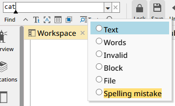
With this option you can find the next spelling mistake by simply pressing F3.
The spelling mistakes in a publication can now be included in the PDF (how to do this will be explained later).
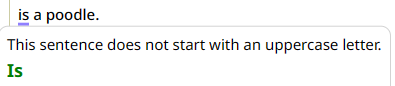
The element content is prepared a bit before sent to LanguageTool. For example, image elements are replaced by the letter "X" :
 is a poodle.
This paragraph will be spellchecked as
X is a poodle.
Otherwise, LanguageTool will detect this mistake:
The preparation is controlled by rules, and they can be customized. By default, these rules are applied:
SpellCheck.ReplacedBy = [
{ nodeName: "image", replaceText: "X" },
{ nodeName: "linebreak", replaceText: " " },
{ nodeName: "link", typeValue: "Reference", replaceText: "X" },
{ nodeName: "phrase", classValue: "variable", replaceText: "X" },
{ nodeName: "reference", replaceText: "X" },
];
Here are the rules explained:
-
Image elements are replaced by "X"
-
Line break elements are replaced by a space
-
Reference links are replaced by "X"
-
Variable phrases are replaced "X"
-
Reference elements are replaced by "X"
A customer my add new rules in a contribution file. The following JavaScript code will add a rule to make "GuiButton" phrases not spellchecked:
m.SpellCheck.ReplacedBy.push({ nodeName: "phrase", classValue: "GuiButton", replaceText: "X" });
Case-sensitive replacement
When text is replaced, the letter case in the found text is now maintained in the replacement text, so-called "intelligent replacement". This only happens if the replacement text is all lower case. Three situations in the found text are handled
-
All lower case
-
All upper case
-
First character is upper case
If, for example "cat" is going to be replaced by "dog", this happens:
-
"cat" is replaced by "dog"
-
"CAT" is replaced by "DOG"
-
"Cat" is replaced by "Dog" (also "CAt" and "CaT" will be replaced by "Dog")
All other combinations ("cAt", "caT", "cAT") are replaced by "dog"
Search and replace attribute values
Skribenta has previously supported finding elements having a specified attribute value by selecting the "Find in attributes" option.
Let's say the following paragraph has a label attribute:

When found, the paragraph was "selected":

Now, an attribute panel will be opened instead:
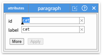
The word "cat" was found in the "id" attribute. Pressing "Find" or F3 once more will find the "label" attribute:
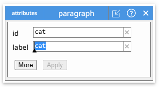
Continuously pressing F3 will close the panel and keep finding attributes in other elements.
Finding attributes supports the options "Find case-sensitive", "Find whole word", but not "Find approximate".
Attributes are also supported in the Replace and Replace all functions. However, the "intelligent replacement" is not performed for attributes - the letter case in the replacement-text is never changed.
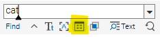
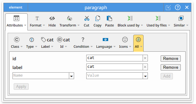
You can click on the More button to get the full toolbar:
Used by
The Used by button in various toolbars previously presented a list of resources inside the toolbar. Now, it adds a tab in the Navigation frame, containing all the resources. You can then use all features available for a resource such as looking at the properties, exploring old versions, etc.
The Used by feature lists all files using different things:
-
The current file
This will list all files containing "include", "link", or "image" elements, pointing to the file
-
The current block
This will list all files containing the same paragraph or title, so-called block.
-
The current element with an ID
This will list all files containing "include" or "link" elements, pointing to the element having a specific ID.
If, for example, a warning is included in various places, you can see where it is used.
Pasting with options
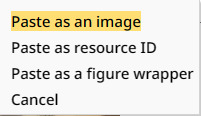
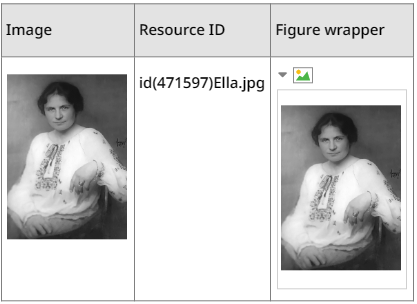
If you copy an image from a folder inside Skribenta and then paste it inside a content file, a confirmation panel with 4 options will now be presented:
-
Paste as an image
An image element will be created, pointing to the image file
-
Paste as resource ID
The resource ID, for example "id(471597)Ella.jpg", will be pasted
-
Paste as a figure wrapper
A figure wrapper will be created, containing a paragraph with the image
-
Cancel
Nothing will be pasted. This is the same as pressing the Escape button.
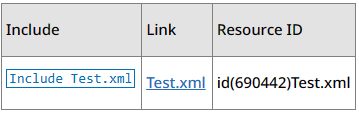
In the table below the three paste alternatives are illustrated:
If you copy an XML file from a folder inside Skribenta and then paste it inside a content file, a confirmation panel with 4 options will now be presented:
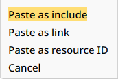
-
Paste as include
An include element will be created, pointing to the XML file
-
Paste as link
A link element will be created, pointing to the XML file
-
Paste as resource ID
The resource ID, for example "id(690442)Test.xml", will be pasted
-
Cancel
Nothing will be pasted. This is the same as pressing the Escape button.
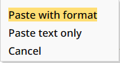
If you copy information from an HTML page and then paste it inside a content file, a confirmation panel with 3 options will now be presented:
Excosoft AB 556275-8788 6 288 000
-
Paste with format
Skribenta tries to map the structure in HTML to Flex
-
Paste text only
Only the text is pasted in paragraphs
-
Cancel
Nothing will be pasted. This is the same as pressing the Escape button.
This image is taken from the Excosoft home page:
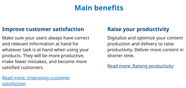
After copying and Paste with format your get this in Flex:
The View panel simplified
Previously, the View panel when publishing looked like this:
Now it is simplified and looks like this:
Publish a TP
When you have translated a publication to a certain language you may want to review the translations in the context of previous translations. A translation project (TP) can now be published where the translated blocks are highlighted.
Let's say your published content file looks like this:
There is Publish button in the Comments column for a job:
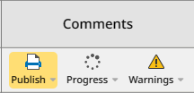
Clicking on the Publish button opens a panel:
Clicking on Start and then View will give this result:
The block ID has been added to each block as a prefix. Blocks being translated in the current project has light blue background. Blocks being translated in other projects have yellow background.
Analyzing the publication in an Improvement project will result in this table:
The two first blocks were translated (and created) in the memory version a805 and the last in the old a32 version.
The Update history for the translation job in the TP tells you when the blocks were translated:
The stylesheet defines how to present the new and updated translations. Below there are no block IDs and the translation blocks have got light blue background:
Various improvements
-
A button for creating an Inline include is added to the Inline toolbar
-
All views have their own caret, so you can see several carets on the screen. However, only the current caret is blinking.
-
The "Replace all" button now requests for a confirmation:
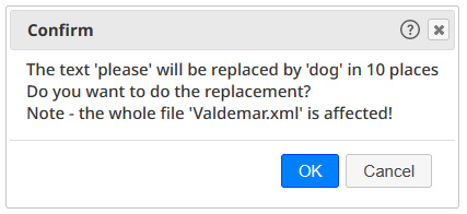
The panel also informs the user about the fact that the operation will affect the whole file - including not visible paragraphs.
-
The view option "Server calls" is only visible for an Admin - its purpose is mainly for debugging the client-server communication.
-
The indentation in the tree when browsing for a folder or a file is decreased. The main title inside a file is removed
-
The icon for an Overview file is now a lighthouse just like the Overview aspect icon:

-
The "Useful information" at the mouse position is not presented anymore. However, it can be turned on by holding Ctrl down while moving the mouse.
-
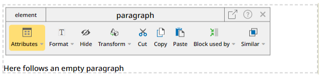
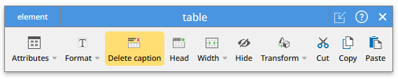
The Caption button in the table toolbar has been renamed to Insert caption:
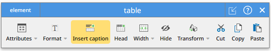
If a caption already exists, the button is renamed to Delete caption:
-
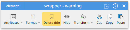
The wrapper toolbar has got an Insert title button
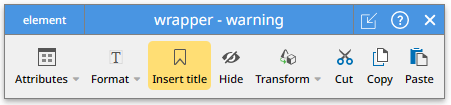
If a title already exists, the button is renamed to Delete title: